Doug Chiang didn’t go to art school.
But as many readers would know, he worked his way up at places like Rhythm & Hues, Robert Abel and Associates and ILM, landing the role as the head of the Lucasfilm art department on the Star Wars prequels starting in 1995. Here he worked with George Lucas on designing a new angle on the Star Wars world.
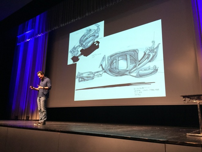
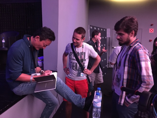
‘What was it like working with George?’, Chiang says people ask him all the time. It was terrifying for two reasons, he explained in a packed out session at the recent Trojan Horse was a Unicorn event in Portugal.
The first reason was that Chiang was trying to fill the shoes of his heroes – Ralph McQuarrie and Joe Johnston. And the other thing was something Lucas told him on the first day, ‘Forget everything you know about Star Wars.’
That revelation completely blew Chiang’s mind because he had been angling almost solely towards mimicking McQuarrie and Johnston’s famous Star Wars designs. However, Chiang reflects now that it was a blessing since it allowed him to dig deep on what was the design philosophy of Star Wars – what makes it work? The end process in the prequels would be slightly different, but the process would be identical to what had come before.
These are the four principles of Star Wars design Chiang came up with.
1. ‘I don’t want anything to stand out’
That’s a quote from Lucas. But Chiang originally didn’t know what the director meant. Usually, he says, if you’re designing something for a big film you DO want it stand out. But what Lucas meant was that he wanted it to all blend together. Chiang says Lucas described it like this: ‘It can be a computer, but it has to be a non-descript computer. I don’t want any costumes, any spaceships, any sets, anything in the movie to stand out. It should just look like it belongs.’

The idea is to move away from these sci-fi things which can sometimes look like one person art directed them all. Lucas’ goal was, Chiang relates, to ask the audience afterwards, ‘What was that vehicle?’, but to get the response, ‘I don’t remember. It just looked real.’ Real life isn’t art directed and that’s what Lucas wanted to do with the original Star Wars movies, too. It was intended to be like a documentary period film, just set in another galaxy.
2. Visual contrast
This is about having clear color palettes and obvious silhouettes so that audiences can quickly determine who’s who and what’s what. In some modern films, Chiang observed, the designs can become too busy. Lucas quickly established the Empire was black with accents of red; the shapes were hard-edged. Conversely the Rebels were different shapes (more organic) with earthy tones of brown and green.
3. Familiar and not familiar
What does this mean? Chiang says Lucas liked to take things out of context. One example is Jabba’s barge – essentially a sailing ship. Right away, you know what it is and that it would be used to transport people. But then it’s in an exotic realm. It’s unexpected and it makes Star Wars unique.

Chiang took that approach in designing the battle droid speeder seen early in Naboo, which is based on a jet ski, and with the Queen’s starship which of course looks like the SR-71 Blackbird. Anakin’s pod racer comes almost direct from a speedster vehicle. The drone drop ship was drawn from a dragonfly design, even though it evolved quite a bit. And the Gungan Kaadu riders were inspired by cowboys as seen in Westerns (a genre Chiang loved).
4. Iconic Star Wars shapes
Domes. Cones. Circles. Thanks to McQuarrie’s early designs, there are now certain Star Wars shapes that make up the universe. Domes in architectural terms are very exotic and they seem to fir the exoticness of Star Wars, for example. Another is the use of white dots on a black surface, say from lights in the Death Star or even the white suited Stormtroopers lining up for Darth Vader’s arrival.
5. Anything that floats can be Star Wars (bonus principle!)
It’s true. Just look at pretty much everything in all the films…

Design guidelines
Out of those four (maybe five) principles, Chiang also developed five design guidelines. I’m not going to go into detail on these but these are guidelines that Chiang developed 20 years ago and followed through with them on The Force Awakens and Rogue One (on which he is the co-production supervisor):
1. Strong silhouette – this came out of Lucas reviewing designs on a wall and immediately choosing the ones that had the strongest and most memorable silhouettes.
2. Three second rule – about as much time as the audience has to see a design and work out what it is. That’s the philosophy Lucas used to approve/reject designs. Chiang says about 80 per cent of his designs were rejected.
3. Personality – every design for a vehicle, set, planet or landscape has to tell you quickly whether it’s an evil place, a dangerous place, a peaceful place. It has to emote something for you, which is tricky because it’s very subjective.
4. Believability – while easily broken, this guideline is all about making believable and ‘real’ worlds and maintaining the suspension of disbelief.
5. Toy factor – Chiang only considers this when the four other guidelines have been achieved. It’s about adding extra flair. Go for the sexy one!

There was so much more Star Wars design philosophy that Chiang shared with the Trojan Horse crowd. I might try and write up some of his Q&A answers at some point, which were incredible.
For now, I’d recommend signing up to Trojan Horse’s THU TV which streamed sessions during the event and also lets you watch a whole lot of other specially made content, including actual sessions, at any time.

Post a Comment