The explosion in visual effects work in comic book films is perhaps only matched by the explosion in design work also seen in those movies – everything from logo reveals, to main-on-end titles, screen UIs and other designs.
One of the studios behind much of this work is Perception, based in New York. It recently tackled Thor: Ragnarok’s logo reveal, main-on-ends and other design elements seen in the film, which took on a very ‘Kirby’ and sometimes retro feel. vfxblog asked some of Perception’s key creatives how they accomplished the designs.
vfxblog: Can you talk about the main logo reveal? What were the parameters here for you from the director and Marvel?
John LePore (Chief Creative Director): The team at Marvel had been working on the idea of the opening title being burnt into the ground by the bifrost, a very playful way of incorporating the logo into the beginning of the film. We gave the logo our “Kirby” treatment and embraced the fun nature of it by having the logo rise up from the ground and ultimately pass through the camera. We were thrilled to see this emphasized by Mark Mothersbaugh’s score, which soars at this moment— making this over-the-top approach really work.

vfxblog: The main-on-ends were fantastic – how did you pitch this, and what approach did you need to take in terms of the 2D stylized look?
Doug Appleton (VFX Director): Before we pitched a single idea, Marvel showed us an early cut of the movie so we could get a real feel for its tone. We immediately picked up on two things: This movie is wildly colorful and you can feel Jack Kirby’s influence in every inch of it. Our main goal was to extend those same ideas into the titles by creating a colorful sequence that literally lives inside a world of shapes inspired by Jack Kirby. We poured through tons of Kirby’s artwork, not just his comic work but his paintings and sketches as well, and traced the shapes to populate our sequence. We even brought that design language into the Thor: Ragnarok logo at the beginning and end of the movie.


We knew going into this title sequence that we wanted to be able to iterate on these frames as quickly as possible, so we had a workflow between AfterEffects and Cinema 4D. All the 2D characters are cards in AfterEffects while the environment is all Cinema 4D. This allowed us to quickly update artwork or entirely replace characters to create new shots without the worry of large render times. With 29 shots in the titles, this became an invaluable workflow early on when things were constantly changing and evolving as we were building out the sequence.
To get the stylized look of the sequence, we actually worked in grayscale which helped us dial in the proper contrast between our atmospheric backlit environment and the silhouettes of our characters. We knew we didn’t want photoreal looking characters, but we also didn’t want them to just be solid black illustrations, so we spent a lot of time dialing in the details to create their low contrast silhouetted look. Once we were happy with where everything lived in the space, we did a color pass on top to get that final colorful look.


John LePore: When we began the title sequence, we had the advantage of already working with VFX Supervisor Jake Morrison on other aspects of the film. Right from the start he brought up Jack Kirby’s influence on the film, which had a major affect on us. As Jake would say, “Kirby was a master of negative space— he never left any!” We became obsessed with the playful shapes, patterns, and forms that Kirby would use to fill out his frames. We went through tons of Kirby’s work, tracing and replicating many of these forms until we had tons of Illustrator Artboards filled with what we called the Kirby Greebles. These shapes became the foundation for our graphic title sequence as well as the various pieces of tech and holograms we designed.
vfxblog: Where do you start with designing a ship interface? What did the designs involve? Did this need to be done for filming, and if, how was it played back on set?
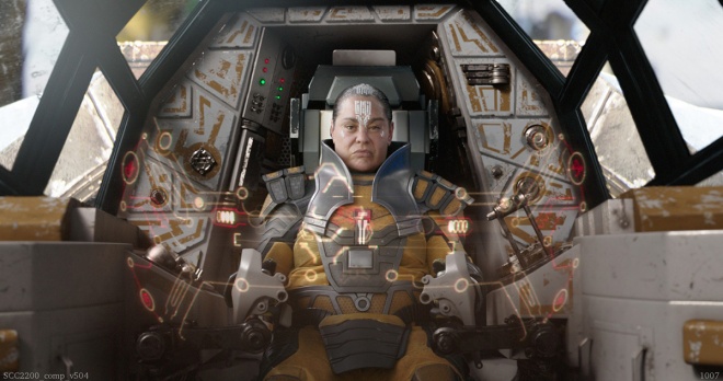
Doug Appleton: When we start the process of designing interfaces there are two important things we keep in mind: What story are we trying to tell, and what type of character are we designing for? We created several ship interfaces in this film, and each one feels uniquely different. For instance, there is a chase scene between Topaz and Valkyrie. Topaz’s ship, the Torana, is like a fighter jet, whereas Valkyrie’s ship, the Warsong, is like an old scrap ship. One interface is sleek while the other is clunky and glitchy. But first and foremost, it’s important to us to tell the story, whether that is warning our characters of danger or leading them towards an important plot point. Without that first, the rest just becomes distractions on a screen.


Russ Gautier (Art Director): Typically we start by defining the role the ship plays in the story and in the world it lives in: is it a cruise liner or fighter jet? Is it in a fight sequence and needs to help support that story, or is it playing a more passive role? Questions like these we sort out with the director and the studio to help us figure out what elements are appropriate, and then we get into designing those elements. Like the Title Sequence, the design inspiration came from Jack Kirby. In many cases we actually started with elements traced right from Kirby’s paintings and comics, and we laid out pieces or blocked compositions with them. This lead us down some interesting paths.
Sakaar posed a unique design opportunity for us since these ships would likely be coming from wildly different regions of space due to Sakaar’s portals. So we wanted to make sure their interfaces were as unique as the ships themselves. The Grandmaster’s Commodore, for instance, had a very slick and flashy hologram generator, while the Torana that Topaz flies during the Sakaar chase is much more purpose-built and tactical, like a fighter jet. Since both were in the Grandmaster’s fleet, they feel like they come from a similar place technologically but with very different purposes.


In contrast to that, the ship that Valkyerie flies, The Warsong, is such an interesting design and has such a unique way of moving that we wanted to carry some of that through to the interface itself, with elements mimicking that cool gimbaling action. But it’s also a rather junky slaver ship seemingly built from salvaged pieces, so we designed the interface to feel like it was cobbled together from different components as well, mashed up, and then plugged into a power supply that was probably far too strong, where it’s popping and glitching out. The result is an interface that feels like it might hurt you if you touch it or explode at any moment, but it fits the unique nature of the Warsong itself and adds dynamic movement to the interior shots in the sequence.
John LePore: All of our work on Thor: Ragnarok was done in post production, which creates some unique challenges— often an actor is improvising interactions with the tech on-set, and their performance will end up dictating some of the layout and animation of these elements. We will base all of this on their various gestures and movements, all while ensuring the interactions appear logical and appropriate to the storytelling.
vfxblog: Can you talk about designs for other tech used in the film?
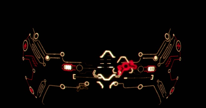
John LePore: When we start designing holograms and other tech for a film like Thor: Ragnarok, our role begins less as designers and more as Technology Consultants. Typically we discuss various bleeding edge technologies and experiments, and extrapolate them into something that would be appropriate for the film’s characters and universe. For Thor: Ragnarok, we combined ideas about advanced tech and holograms with vintage video games like the Vectrex and antiquated display technologies like the Tektronix tube vector graphics terminal. This allowed us to have a logic that wouldn’t just drive how the technology would look, but would also provide a guideline for the artifacts or degradation that could be seen in the tech— making it all feel more real.

Russ Gautier: We spent a few weeks in the early phases of of this project focusing on developing tech concepts for the world of Sakaar. Since the technology on Sakaar is salvaged from what comes through the portals from all corners of the universe, it was a rich playground for us and the team at Marvel to develop ideas that hadn’t necessarily been seen in the MCU to date.
vfxblog: What additions did you make to the Marvel Studios logo? How, technically, is that elaborate work pulled off?
Doug Appleton: We first redesigned the Marvel Studios logo last year for Doctor Strange, and since then we’ve updated the footage slightly with every new release. For Thor: Ragnarok, Marvel Studios and director Taika Waititi wanted to do something a little different by transitioning the logo directly into the first shot of the film. The idea was that the logo would start to catch fire and burn as the camera rises up to reveal a cave. Because the second half of the shot belonged to Method Studios, we had a back and forth with them sharing assets and progress. We would do a pass at the logo and send it off to them, they would make a pass and send it back to us, all the while getting feedback from Marvel at every step. So it became a really collaborative process between us.
Russ Gautier: When we first built the new logo animation for Marvel Studios a year and a half ago, it was important to the studio that we be able to update the content to reflect the more recent movies with relative ease. So we took that into account during the building phase and came up with a workflow that allows us to edit, color correct, and place new pieces of footage in After Effects; we use Cinema 4D for generating reflections and illumination and recombine everything pretty quickly while retaining a consistent look. For this film the Marvel team wanted to include Gamora from Guardians Of The Galaxy 2 in the mix.


 A session curated by Amit Tandon brought together names from some of the most prominent gaming companies around. A panel consisting of folks from Rovio Entertainment, Stick Sports, Google, Nazara Games and King discussed and assessed the trends which India might see in the next year. The group also discussed about the importance about the subscription-based model, suggesting developers to switch to the aforementioned model if they are unable to monetise their game through in-app purchases. The panel further discussed about single and multiplayer games and where they stand, concluding it with the fact that both the style of games are still valid and both of them work. They stressed that local content will be the way to go if created correctly as it will resonate more with the audiences of a specific territory.
 Roach Interactive’s Rahul Sehgal spoke to a sizeable audience about the challenges and things to keep in mind while being an indie studio or artist. Drawing on his own experience, he laid out a bunch of guidelines for aspiring indie developers to adhere. He stressed on point like building a strong team, keeping the creative ego in check, analysing, looking for feedbacks and much more.