Luma Pictures had to look at some pretty horrible ear canal reference for their ‘Alien: Covenant’ effects
Posted in: Animation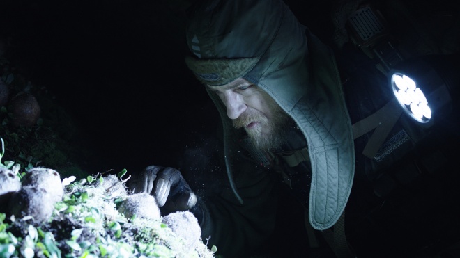
For Alien: Covenant, Ridley Scott’s newest deep dive into his Alien universe, Luma Pictures was called upon to create visual effects for several sequences. The studio researched and realized the tiny spores that inhabit some of the characters, including via ear canals – just getting that right required some pretty grotesque reference. Luma also delivered some other-wordly lamps inside the lab of the synthetic David. They rounded out the work with set extensions and graphics. And they killed James Franco.
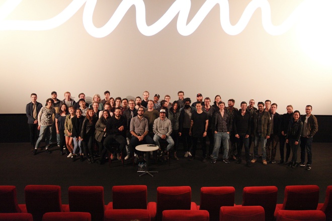
Luma visual effects supervisor Brendan Seals, based in the studio’s Melbourne office, runs down the work for vfxblog in this interview (he collaborated with LA-based Luma associate visual effects supervisor Jared Simeth). I also had the pleasure of recently sitting down with Seals, animation supervisor Raphael Pimentel and CG supervisor Andrew Zink at a screening of the film and a Q&A in Melbourne recently.
vfxblog: Early in the film, we see the spores or motes have an influence on members of the crew – can you talk about those shots?
Brendan Seals: Well, that was the main catalyst for myself and our digital production manager Justin Porter flying up to Sydney to meet Charley Henley, the production vfx supervisor, because that was very much at the beginning. It was not an open brief, but it was very much looking to Luma to inject some of our own ideas into the process and really develop alongside Charley.
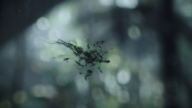
Their initial ideas were very much about dandelion seeds and in terms of movement the murmuration of flocking of starlings was a big inspiration. The idea being that these dots on the screen, they’re quite insignificant. They’re featureless dots, they don’t really have a silhouette or shape per se because they’re supposed to be mysterious. But by congealing it and forming some sort of silhouette you get the sense that their numbers are greater in a team, in a sequence, rather than on their own merit. And by being as a group they can achieve a much more sinister goal, let’s say.
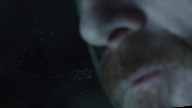
The characters just perceived them as mosquitoes or really tiny insects, but of course to the viewer we get these macro and close-up vantage points where you can clearly see them forming almost a creature silhouette, and that just conveys that there’s something much more intellectual at play here. And in true Alien fashion one character decides that they’re so insignificant that he’ll blow a smoke ring towards these spores. The smoke ring we actually went through simulation iterations and found that in actual fact maybe the best way is to go old school, and so we actually rigged up a smoke rig with a Coke bottle with a hole cut out the other end, and blow smoke through it. And there’s tutorials online about how to recreate smoke circles, there’s a whole cult following on creating various designs and shapes with smoke rings, but we just did that. And we filmed it with the right focal length and then filmed it against black, did many, many takes, and then comped that in. That’s kind of how we got that to final.
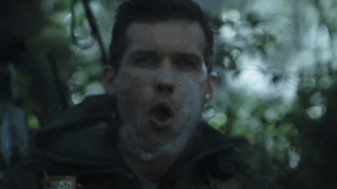
That smoke ring was really the catalyst for these spores to go from just following wind currents and the natural atmosphere, very passive, into a very aggressive form. They cluster together and begin to form this silhouette. And this silhouette was a deliberate silhouette. It was something that we designed internally because we thought rather than, to say it’s ambiguous is one thing, but to give it some story and give it some context we thought, well, let’s actually design the creature internally and map out what does that look like, and that’s what the spores adhere to. Once we did that it was a much clearer goal and path for us because we knew the embodiment of the creature and what characteristics we want to convey, and the dots, the featureless dots would just be attracted to that and following that as a guide.
So our concept artist Nicolas Pierquin, he actually went through a design process, very inspired by Giger and his facehugger in particular, so he designed a model, rigged it up, went through animation, and that became the catalyst for the movement. And it’s almost reminiscent of a jellyfish with a spiky tail suspended in the atmosphere. And that would move around and ultimately move towards the ear and travel inside.
vfxblog: Which sounds pretty gross.
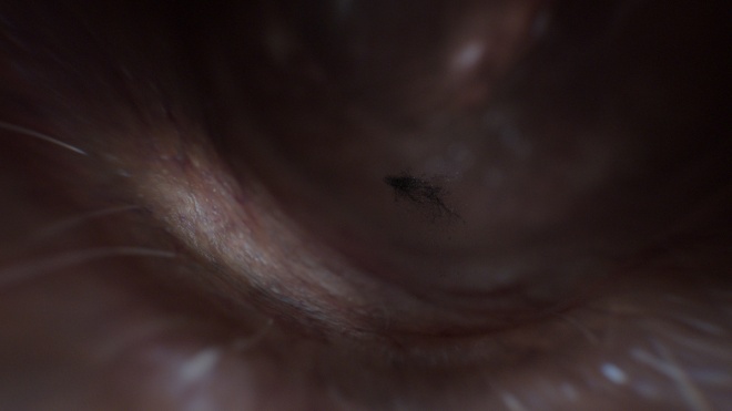
Brendan Seals: I’ll tell you what, there’s no doubt about it. The references that we went through and presented to Charley were not for the faint hearted. You look online in medical journals it’s all about people that are in ill health. You don’t generally find really good hi-res photography of a clean ear. So the reference to begin with was quite nasty, and then the challenge for us was reversing the camera. So our sequence actually has the camera situated against the eardrum looking out of the ear. And of course there’s no such photography in any resource that we found, so we mapped the ear canal with real photography as a start, reversed the camera, and just discovered what would you see from that perspective.
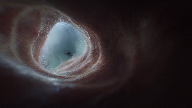
And then obviously what often happens, the most realistic result isn’t the most cinematic. And we started the brief with Charley to go very visceral, very raw, almost medical journal doco, like very endoscopic referenced photography. But it just didn’t look like, it felt like it was part of the alien landscape. And early on pitched to Charley that I wanted the aesthetic to be a bit reminiscent of those dark backlit moody tunnels of the juggernaut in Prometheus. I kinda thought this is a really cool moment to call back that aesthetic. However subconscious it is I just thought you know those kinds of aesthetics are really what’s strong about the alien franchise. So we gave it a bit more moody backlighting, more specular and wetness and moist qualities. You know, this should be an environment that is unpleasant to be in, I don’t think you’d want this to be a pleasant experience.
They travel as this creature silhouette into the skin, they puncture the surface of the skin near the eardrum, and then release gelatinous goo into the bloodstream very reminiscent of the black goo from Prometheus. And then this thing hyper evolves and bursts out of the poor character’s back. So I think the motes kind of serve their purpose there, they’re almost the catalyst for the demise of the crew. It’s early in the film and it just sets up the chain of reaction.
vfxblog: Tell me about the work involved in David’s lab, and the lamps you worked on?
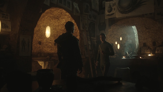
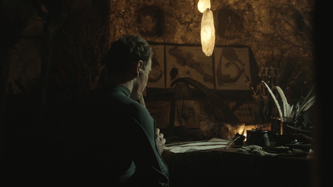
Brendan Seals: David’s lab is almost kind of reminiscent of a dark sinister version of Degobah from Empire Strikes Back, in a way. With all these horrific creations and failed experiments it very much looks like it’s the journey to creating the ultimate Xenomorph. So the lamps are the primary lighting source of the environment – it’s a very moody, dark environment, and it’s singularly lit with these lamps. There’s not a lot of cinematic cheated lighting. It’s very much realistic environment lighting as if you were just putting a camera inside this laboratory in this cavernous system and these lights are illuminating the character. So if they push away from these lights they just turn into darkness. So it’s a really interesting mood set in this interior.
They’re all hung on wires, they’re probably about a foot tall and very much inspired by salt crystal lamps. Again, it was like this with everything we saw on the show, production design was superb, cinematography is superb – they got a lot in-camera. And I think it is one of those cases where there was deliberate choices made by Ridley and the production team on the day that over time was a sound decision both before and after. And it just made sense to not deviate too much from that aesthetic. And whilst we were brought on board to conceptualize a complete re-do, with each iteration we kind of curved slowly and surely back to the look of the plate.
We initially were designing this membrane that is a sheath wrapped around a light, so it’s just very fleshy intestinal lining of the stomach of a cow. And then that’s wrapped around these orbs inside that are very reminiscent of a lava lamp. So as we went on we realized that they were calling too much attention to themselves. Because this scene and scenes in particular were all about the dialogue and obviously the horror of David’s creations and the dialogue ensuing based on that. So the more we pushed the lava lamp aesthetic with the orbs floating and moving around and the membrane bubbling and billowing out, it just seemed to detract a little bit from the intensity of the dialogue. So we ended up restraining that and just taking some of the vein elements of the sheath and using that as an additional layer on top of the practical photography.
And as far as the lights themselves, we did do simulated orbs that roil and move and bubble inside the lamp, and then they have a swarm of motes almost like flies or mosquitoes attracted to a light source and a moving cascade around this inner light source. One of the challenges was that there were some shots where the lamps weren’t accessible on the day for the photography so they were just stand-in practical lights. They weren’t actually the salt crystal practical lights that they had in many shots. So we actually did have to re-create full CG versions of those lights that we had blended in with the inner orbs and veins and then populate those into the many plates just to make sure there was continuity there.
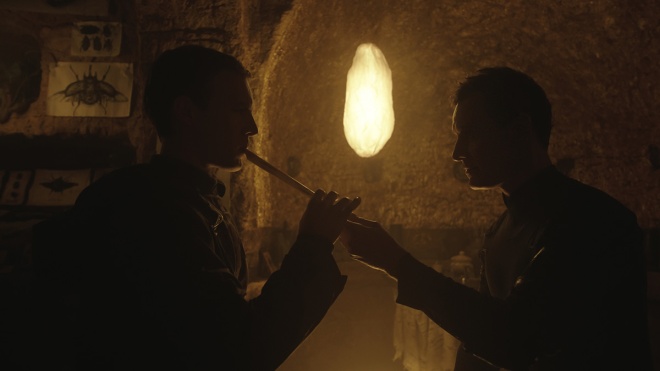
In the end, it was kind of this hybrid approach where you’re augmenting and adding lights to practical lights, and then you’re re-creating in CG to be able to populate into other plates which didn’t have those as practical lights to begin with.
vfxblog: What was the challenge of tracking those lights into the scenes?
Brendan Seals: Interestingly, the takes are very long. It’s a very moody, brooding sequence. And with that comes that complexity of continuity because you have to track where they are in space, obviously, but also how they’re moving, how the inner orbs are moving up and down, and how that looks over many, many shots. But also because it’s dialogue-driven there’s a lot of cuts, a lot of back and forth, and you’ve got to make sure that the position of these lights is identical in all the shots.
So we basically mapped out the LIDAR of the set and then made sure that all these positions that we saw of the practical lights in all the plates were assigned to positions in this LIDAR. And that became the basis of a database that we would then map the shot number, the number of lamps, the prefix that we assigned to each lamp, and then it would populate for any given shot based on a flagging system on our database. So it was very much automated. And there was obviously a bit of engineering to get that automation working, but that was a really good way for us to make sure that if we had a slightly skinny lamp or a slightly wider lamp or a slightly brighter lamp that that particular variation of that lamp was snapped into position and assigned to all the relevant plates that had that particular design.
vfxblog: Luma also worked on some graphics displays in the film – can you run through what was involved here?
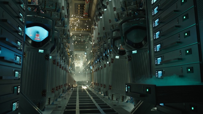
Brendan Seals: Inside the ship there’s a colony of occupants in chamber pods who are fast asleep, and there was a combination of things that we had to do for this sequence, one of which was extending these pods. It was very much an aesthetic to have vast, long, winding interiors almost to the point where you know you can’t see an end in sight, and that’s just to convey how many occupants are in this colony with Walter as he is walking through the interior managing the diagnostics. And part of that is when he touches his hand on these chamber pod glass display windows these graphics are activated detecting his thumb print and his ID.
It’s more of a story point later on when the ship is damaged, some fires are started within the ship and particularly within James Franco’s character’s, Captain Branson, his pod. And the graphics are very much, very medical driven. They’re not the overly stylized graphics that we saw in Prometheus. Very much serving a purpose. Function is before form. And so the graphics are very highly saturated, very angular, not curved like what we saw in the Prometheus, and then very much about the diagnostic display device of the occupant. And then later the story point of Branson with the fire that’s ensuing inside his pod. Oxygen decreasing, heart rate increasing, those sorts of things.
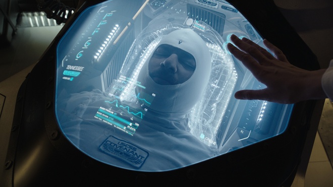
So we went through a design process with Charley just to get that kind of gritty, raw medical kind of look. Very angular, quite simple in a way. And then just make sure that all the diagnostics had real-world metrics. So you know we did a little bit of research on oxygen levels, heart rate, bpm, resting heart rate, all those sorts of things that could tie the story together for when they’re fast asleep or hyperventilating because there’s danger ensuing.
vfxblog: How did you actually pull off those extension shots?
Brendan Seals: It’s all about an invisible work, which I often find quite exciting. Particularly with Alien the photography is so good to begin with. We’re talking chamber pods falling from their apparatus and structural supports with real sparks in camera. There’s so much you can draw from in the base photography. It just makes the experience so much richer for the artist. They shot plates with one set of corridors and then a green screen, and then they would cleverly position the camera further back to push that set of corridors away from camera so that we could slot that in as the next set of corridors, and then we can just repeat that process on and on and on. So there’s a mixed bag of clever tricks. Some of it was two and a half D where we’re projecting plate photography and then sliding that back to create this repetitious never-ending hallway. Other times it’s them moving the camera back and then providing alternate plates for us to composite in. Even some reconstructions in complete 3D where it was necessary.
vfxblog: How did you kill James Franco?
Brendan Seals: It was supposed to be fire engulfing him quite quickly and us really getting from Plate A, which is Branson’s performance, to a dummy that they actually shot inside the chamber. They had put a dummy inside the chamber, they rigged it up, and very crudely thrashed this dummy around and then they really lit it on fire inside this pod. And so the task initially was to transition from Branson to this dummy with the fire that was in plate, but unfortunately the fire captured inside this pod wasn’t quite visceral and intense enough and we were definitely playing it over a number of shots so it’s one of those things where you start to adjust one thing and it becomes this chain reaction of okay now you’ve adjusted the fire here, and there’s continuity in the next shot, we probably need to do a fire simulation. If we’re doing a fire simulation, probably need to do some smoke simulation. Hey, we were doing some fire simulation we probably need some geometry to emit the fire off and burn and char. We probably need to put Branson in there. Hey, we need Branson’s face.
And it just becomes this kinda spiral thing where what started out as a simple effect becomes a recreation of the performance of Branson, the animation team animating it, digi-double thrashing around, you know the effects department emitting from a digi-double and the flames and smoke cascading and roiling in this chamber, and it just became a bigger thing. But I think obviously in the end it was all for the better because it’s a much more successful integration.
Find out more about Luma Pictures at their website: www.lumapictures.com

Post a Comment