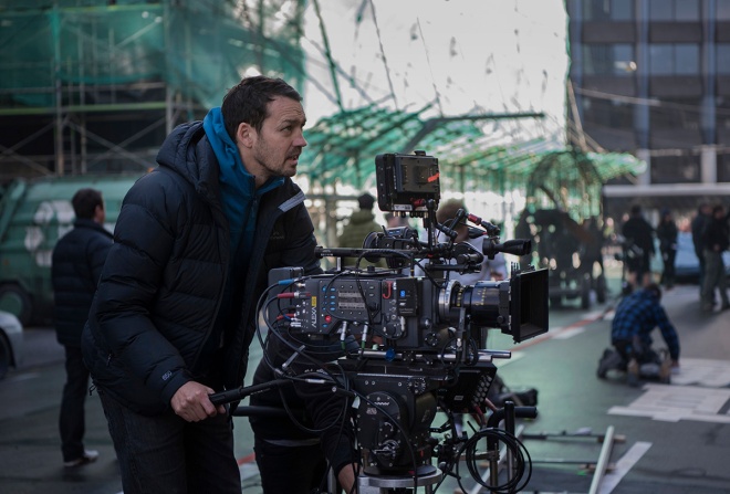
For the premiere issue of the Visual Effects Society’s new print magazine, VFX Voice, I set out to cover the effects of Ghost in the Shell. I was lucky enough to speak to visual effects supervisors Guillaume Rocheron and John Dykstra, and a whole bunch of artists from Weta Workshop. I was also able to interview director Rupert Sanders about his approach to the practical and digital effects in the film.
Now that VFX Voice is out – see the cover article here – I thought I’d feature the full-length interview with Sanders here on vfxblog, which covers a lot of the director’s thoughts that couldn’t make it into the magazine for space considerations. Hope you enjoy.
vfxblog: What attracted you to telling a live action Ghost in the Shell story?
Rupert Sanders: I think what attracted me to Ghost was there was an opportunity to exist in both worlds where you had a big spectacular action-packed film, but also you were left with something resonating beyond just spectacle. And there’s so much in that [original] film to borrow from about technology and humanity that seemed to me, that would make it a richer and more memorable experience. I think there’s too much, too many blockbusters are basically just – they exist for two hours and don’t exist beyond that, and to me it was important that we made something that satisfied both the desire to see something amazing but you know that would be more kind of cerebrally engaged and stay with people longer.
vfxblog: That’s interesting isn’t it because visually there is so much to draw from with the existing material, but how did you actually use that? Was that just the jumping off point or did you really take the chance to do new things as well?
Rupert Sanders: My first part of the process was to write and kind of collage from stills from the anime and Innocence and Stand Alone Complex, and I started just to collage lots of images and ideas that I liked within that. And then I wrote a story around that and built a kind of graphic novel. We were told early on by Oshii [director of the original anime] ‘do whatever you want, we’re not gonna be like beholden to, you don’t have to be beholden to what’s gone before. You guys should make the film that you see fit.’ And I think, you know, to me I’m a fan. I was, my big kind of pitch to Steven Spielberg when I first met with him on the project was, ‘You have to really embrace the anime and deliver in the film those things and some of those scenes that people expect to see and kind of demand to see. And you have to treat the original with respect.’ And he got that very quickly and that’s part of the reason he asked me to continue the work on it.

vfxblog: Jumping into the visual effects, you’ve obviously had quite a lot of experience with VFX with commercials, some of your shorts, and Snow White. Can you talk about the kind of things that you learned on those that you brought into Ghost in the Shell?
Rupert Sanders: I think a general kind of aesthetic, really. I mean I think most of my visual effects experience comes from learning Photoshop, you know. Visual effects are really a kind of expanded Photoshop. Once you understand how to work on those layers you kind of understand visual effects. But I’ve been lucky to work with great people along the road. And for me, I use visual effects to embellish and do things that aren’t achievable in-camera. I try and do everything else in-camera. We built a lot of animatronics, we did a lot of prosthetic makeup, we built a lot of sets, we did very little full green screen environments. In fact green screen was really just used for window extensions and sets, and a couple of sequences we did a bit more. But generally on the whole there was not much green screen on my set, which is, that’s why we went to Hong Kong. We got a good stable layer that had the grit and authenticity, and then on top of that we start to embellish it with visual effects.
vfxblog: One of the exciting things is the use of some miniatures and using that for photogrammetry, but also the geisha’s being handmade and the silicon suit being handmade. Tell me more about how those practical things really helped on set.
Rupert Sanders: I mean the miniatures were something that Guillaume [Rocheron, visual effects supervisor] and I discussed early on that, you know, we liked. I kind of liked the idea of having, building a miniature and then photographing it that gave you a kind of more photographic – instead of using every background plate needed a corresponding miniature plate and you do motion control and stuff. I thought it would be interesting just to like build the miniatures, photograph them, and then use them for texture so you’ve got a kind of miniature feel without having the kind of laborious process of miniature shooting. So it was really a new way of using miniatures and I think it’s been really successful in the process.
And the geisha, she was a character and it was important that she became quite a signature part of the film. I don’t think that she would have done if she’d just been a CG element. She was a character and a prop that kind of kept being used because it was so successful and we kept using it in lots of different scenes. And that definitely wouldn’t have happened if it had just been a girl in a green screen suit.

vfxblog: What about how all this impacted on your planning stages, and things like working up artwork but also previs? Can you talk about your experience there in that sort of crucial planning stage?
Rupert Sanders: We did very little previs actually. Most of it was fairly unplanned to be honest. But actually, you know, we actually didn’t have the money to do extensive previs and we had a very tight visual effects budget. We had a very tight production budget. So you know we were having to use our initiative and we were having to be, you know, clever and resourceful and there’s props in the film that are used three or four times for three or four different uses in order to kind of save money and to, you know, to create a kind of continuity through the film. It was pretty cost-effectively done and that kind of thing was inspiring really and helped us be creative because we had to be, we had to figure out creative ways of doing things practically. And so a lot of our ideas came during the shooting or the prep the next week. You know, what do we fill Kuze’s lair with? How do we hang Major from the ceiling? I think we ended up using the thing that repairs Batou’s eyes as the thing that hangs the Major from the ceiling in Kuze’s lair. So we were kind of free-forming a bit.

vfxblog: And that free-forming actually often allows for some free-form creative decisions. Can you think of any examples where you know you were surprised with the way that you went? The deep dive sequence seems to have come from lots of different ideas.
Rupert Sanders: Yes, that was something that I kind of storyboarded myself early on and it definitely changed a bit along the way. We had extras which are fairly inexpensive compared to visual effects, so we had a lot of extras and then I just got wardrobe design to make some plastic suits that we used. In that scene we covered them all in black oil and had them slipping around and grabbing at Major and pulling her back in. And then we used the same people, I was trying to figure out, what do we put in Kuze’s lair that makes him threatening? And I came up with this idea of having all these people in the same suits that were all linked together by cables that were generating his network. And then I was like, how do we make them different? So we kind of Vaselined over their eyes and then we doused them in flour. You know, what can we get cheap? I don’t know why they’re covered in flour. I’m sure there’s some kind of sci-fi reason for it but it just seemed like a good idea at the time. So then throughout that sequence we could then use, you know, flour along the hallways – we used it for people to be being prepared to go into these networks, they were being you know their heads were being shaved and they were being covered in this flour.
In the end it all kind of forms together but it was all very free-form and these were just like ideas of what have we got around us, you know it was literally like looking around the studio what have we got, you know, what can we do cost-effectively? There was a lot of re-appropriating sets and wardrobe and actors, neck ports and stuff and what textures can we get inexpensively? And so it was a creative way of solving paper problems.
vfxblog: I feel like, Rupert, you’ve got a great understanding of black oil based on one of your shorts, The Book of Eli, Passenger and Snow White.
Rupert Sanders: Yeah, I like black oil. I think liquids have always been good for practical effects. They’re something that’s very expensive to do digitally and it does have an amazingly kind of dream-like quality. In the shelling sequence we built the Major skeleton in entirety with 3D printing at Weta. And we built that, and we dunked it in liquid and we built mannequins of the Major that we dunked in white liquids. So, it’s a lot of practical effects I think that when you blend in some of the CG backgrounds you start to get more of a tactile feeling. I always wanted Ghost in the Shell to be a tactile world that you felt really existed and that you weren’t in something that felt thin and unrealistic.
vfxblog: I’m not sure that directors get asked this very much but after doing so much practical stuff in this shoot what was your post experience like? How did you interact with the editors and visual effects teams on a daily basis just to get this film finished?
Rupert Sanders: I’ve been in with John Dykstra who’s based with me in my office, I’m in with him three or four hours a day and then I’m in with the editorial department, my editor Neil Smith and Billy Rich, I’m in with them the other half of the day. I call them the ward rounds. You literally have to be very in tune with what’s going on across all departments to be able to really deliver it. And we’re still concepting as we’re doing visual effects. We’re still figuring out things that you get more kind of understanding of what you’re trying to do as the film progresses. So it’s been a very evolving process this one.

vfxblog: Just on two separate sequences or aspects of the film. I love the city and hologram views. Could you tell me a bit about your thinking behind how those were to look but also it was really interesting to hear how they were realized as well?
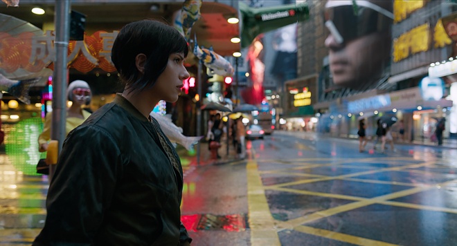
Rupert Sanders: Well, we came up with this very specific idea of what we called the ghost cam, which is these floating through the city shots as a way of showing the world. And I then wanted to populate them with what I called solograms, which are these kind of solid holograms where in an augmented reality you see a city that advertises to you and objects seem to hang in space or walk alongside you at a hundred foot tall. So we’ve got basketball players shooting hoops across streets. We’ve got city, NASDAQ information being speech bubbled out of people’s faces that are embedded in buildings. So it’s a real kind of kaleidoscopic kind of carnival of scale and kind of surrealism really that our cities exist in.

And Guillaume Rocheron, who is the visual effects supervisor who started on the film early with me, came up with an idea of – he mapped all the camera routes out using Google Maps. Our previs was based on Google Maps. We couldn’t afford to do full previs so he did them on his own using Google Maps which then gave us the flight path. We then flew a helicopter up and down those paths photographing textures and roof textures and then photographed the same place from the street so we could kind start to build an environment. Then we built wireframes and added those textures. Then we started to add our miniatures and our paint-overs that gave us the three dimensional city.
Then I tasked my creative assistant Julian Wayser with operating Dayton Taylor’s rig, which we designed for this film which is a kind of bubble of cameras that could allow a fifteen second take that was fully immersive. So you saw the actors from every angle and then it was glued together to create the action plate which then became the solograms and then Julian and I designed the world of solograms by creating commercials and adverts and graphic design. And all these sequences were then laid into the city. So there’s a lot of work that’s gone into a lot of layers and a lot of complex kind of graphic design with a great designer called Ash Thorp who did a lot of the building stuff with us for the solograms. So it’s a pretty dense world when you fly through it.
vfxblog: And just finally the other sequence I wanted to ask you about was the water fight in the flooded slum area. I’m just curious because that’s obviously an iconic one from the anime, but where you wanted to take it and also how you wanted it to be realized.
Rupert Sanders: I think that was one of the ones that I felt as a fan if I don’t see that in the film I’m gonna be really upset. So there were a few things that I felt it was very important to keep in the film and I think that was one of those. And so I wanted it to feel, you know, close to the anime.
So we built a water tank in New Zealand and that’s one of the few things that we did, you know, almost entirely green screen. And then we tiled a lot of Hong Kong, we scouted a lot of apartment blocks and tiled them, we built the first kind of path that was more realistic and then Guillaume and I started to design, you know, how you’d make that a bit more sci fi. But it’s definitely a big nod to the anime, that sequence.
For more coverage from the film check out my articles:
VFX Voice – Effects Elevate Dazzling Live-Action Remake of Classic Ghost in the Shell
Cartoon Brew – ‘Ghost in the Shell’ Marks Another Step Forward for Live Action-CG Hybrid Actors

Post a Comment