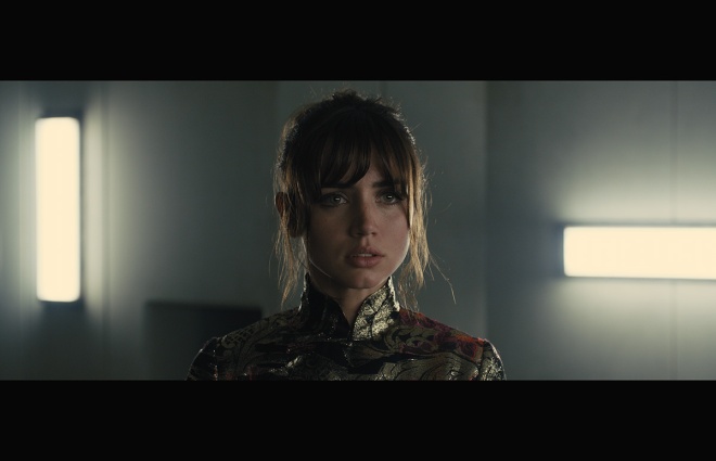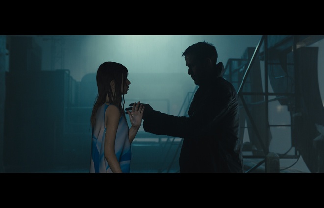
Denis Villeneuve’s Blade Runner 2049 is one of the 10 films short-listed for the VFX Oscar. I’ve covered several aspects of the film so far including with overall visual effects supervisor John Nelson, but here is a brand new interview with Double Negative visual effects supervisor Paul Lambert. DNEG was responsible for views of future Los Angeles, Joi the holographic girlfriend of K, and a memorable ménage à trois featuring Joi and K and Mariette.
Check out the Q&A below, plus a befores and afters video breakdown of many of these visual effects and other shots in the film by studios including Framestore, Atomic Fiction, MPC and Rodeo FX.
vfxblog: Just firstly, what was it like coming onto a Blade Runner film, given the rich history there in VFX?
Paul Lambert: It was daunting because everybody knew what Blade Runner was, and my biggest fear was that we would produce work and some of the comments would be that the visual effects were actually better in the first one than in the one done 30 years later. It was daunting, but then, we were surrounded by some of the best of the best. From the very first day of the shoot, it became apparent that I was working with some of the best in the industry.


vfxblog: With the views of L.A., there was a significant amount of real footage shot, but how tricky that is to incorporate real into the final shots?
Paul Lambert: We had shot those plates of the favelas with two helicopters. One was, it’s supposed to be the spinner, and one was a flyby over those vast hills. One of the specifications, which we really had to stick to, was that we needed an overcast day. The shoot extended for a little bit longer than what was budgeted, because obviously, there were some days where there was too much sun, but then I kept it at it, and we finally could see plates that were generally overcast, because basically, you don’t get to see the sun popping through in Blade Runner, so we needed a base in which you couldn’t properly see the actual sun direction.


Now, some of the plates had a little bit of that, so then we had to grade some of it out. But also, part of the world of Blade Runner in 2049 was that there’s no greenery, there’s no trees, there’s no grass, and all of those plates had green everywhere. You had trees, you had fields, you had all sorts of stuff, so that all had to be covered with CG.
Because you’re working with a plate, you know exactly what to match to. I’d block it up and would be adding some megastructures into the distance, but it was always trying to keep the basis of a plate because that’s always the best CG; it’s always the best guide. Even though we had plenty of other shots which were all CG, the fact that we had done our initial set-ups based on plates gave us an understanding of what those all-CG shots should be.
vfxblog: I understand the way you showed the huge streets from the air changed, with the roads going deeper and deeper.
Paul Lambert: Yes, you didn’t want to see any cars, so basically, we had to get rid of all of those. We had to carve some of the roads to be deeper, so that it felt as if there had been a build-up over time of the structures, while always trying to maintain the sense of advertising still going on. Even though it was supposed to be a much more desolate place, you still had those ads, you still had those drones flying by, and you could still read life down there, but you couldn’t actually see people in cars.


vfxblog: How did DNEG approach the hologram ads? John Nelson mentioned in a talk something about the ‘Patented Dneg Hologram’.
Paul Lambert: Basically, we had done some initial concepts of projected ads. What it is, is that, you get to recognise an image, but it’s broken down into various layers, but then one common thing throughout nearly all of our ads is that you see some of the projection lines. I’m not talking about projection lines from a source, but I’m actually talking about projection lines at right angles to each other. It’s kind of like a box. It’s kind of like a cubist environment around the ads. That was our general guiding principle, and that’s what Denis would call the, “Patented Dneg Projection”.
vfxblog: When you did have to build the major L.A. city area in almost completely CG, I’m curious, what sort of challenges were there?
Paul Lambert: One thing which we wanted to avoid was to use any form of auto-population of buildings. We had set out from the beginning that we were going to art direct each shot and we were going to place each building, rather than have an algorithm try and help where to position different buildings. This was a huge build up, because we didn’t see a plotted city for months and months, just because we were building assets. Basically, we had three tiers for the buildings. We had the big megastructures, which had the most detail, and they would be the ones which we would fly by really closely. We had mid-ground, and then after that, we had distant ones. Each one had a different amount of detail. Obviously, if it’s really far away, you don’t need to see as much detail. But also, we tried to make it a little bit modular as well, so that, rather than doing 100 megastructures, we did far less, but then we broke it down into a way in which we were able to add different pieces to different buildings to give us a new shape.

The underlying design for this Blade Runner was very much a brutalist concrete kind of deal, and one of the terms, which we coined from the very beginning, was a top-heavy building. Basically, whenever you see the buildings in Blade Runner, basically you’ll see a lot of structures where the building actually feels as if it has more structure on the top than it does on the bottom, and that’s what Denis started to use as a … ‘Paul, I need this to be more top-heavy.’
We had done some concepts at the very beginning, way before anything was shot, and the art department had also done some. But then, we got to actually start to build the assets, and then DNEG started to do some of the concepts as well. One of our concept artists actually gelled really well with Denis. I think one of Denis’ comments was that, ‘This guy is like my brother. It’s exactly what I want.’ From there, we always used that guy to pick out the actual concepts. We would show Denis the concepts, he would approve of them, and then we would spend the next two or three months building it, because it did actually take a fair amount of time to get that kind of detail.
Now, we built all this detail, and in a lot of the shots, even though you have billions of polygons in there, once we added the atmospheric and stuff, you didn’t get to see much of that detail, but there were times when we actually flew by a building and it was good that we had that detail, because we were able to match it properly to actually show off the structure.

With the atmosphere, in trying to depth-haze it and trying to add smoke and trying to add smog and trying to add fog, there were times when you had everything in there. It was always going to be blocked out. You were never going to see a pretty vista. That was actually one of the hardest things, to get some of the artists to release themselves from trying to make something look pretty to actually see off into the distance, yes? We had all this detail. We needed to muck it up, basically, and you weren’t supposed to see into the distance.
This was a big one, too, is that, as a CG artist, you’re always trained not to allow things to go black. You don’t ever want to deliver anything to the client with black. Not in this film: Roger Deakins had shot some frames, some shots, where it goes into nothing; it goes into blackness. I was constantly having to remind people that it’s okay to go off into black.


One of the biggest things to actually render for us was the rain, because once you’ve dropped everything out, and you have a dark city with all this lighting, you have spinners, and you have projections, and all sorts of things going on, you need to make sure that your rain is actually physically correct. Usually when you do rain, you do a front, a mid, and a back, and you just kiss it in, and you kind of get away with it 90% of the time, but what we quickly found was that once you don’t have a full vista but then you actually have lights close to you and you have spinners flying by and you have all these ads and stuff, you have to make sure that your rain is the right size, it’s falling at the right rate, and it’s being lit correctly.
DNEG uses Clarisse, which is a physically-based render, it’s just like, to do something physically-based, you need some time to render. The rain to sim took a while, and then to actually render took a while, but there were certain shots where you really get that sense that something is flying through that rain, or you’re passing by camera. I think it was really successful, and it adds so much to the realism of each shot.

vfxblog: Let’s talk about Joi and the threesome. It has to be one of my favourite effects scenes from the year. What I’m really curious about is experimentation and testing, and what you could do in terms of any slap comps or the like. Just tell me about experimenting and working through and finding the right gist for those shots.
Paul Lambert: That’s actually my favourite part of our work. For the merge, it was very much a steady progression. Obviously, John would’ve explained to you previously how we shot it, where we had both actresses and witness cameras and that kind of thing, but the actual build-up for us to produce any imagery, for DNEG, took months and months, because basically, each character had to be 3D-tracked. This was never a movie where you were going to cover your leading lady in dots or have rigs and stuff. It just wasn’t that film. There was no way in hell that Roger or Denis would ever do that.

Basically, we had to do it using witness cameras. Trying to capture the actresses and Ryan from a series of different angles, so we at least had a reference as to where different body parts had to be in a frame, because traditionally, when you track something, you can get away with a lot if it’s always through the camera. If you were suddenly to turn to the side, you’ll see that the arms and legs aren’t exactly in the right places, but you kind of get away with it, because you’re actually looking through the camera, so that you don’t get to see any other perspective.
Now, what we were doing with the underlying Joi effect and with the merge was, we needed to do something very robust in that. We needed to get a sense of volume, so as we were tracking for the merge and stuff, what we did first of all was do a 2D version. Basically, we would extract Ana de Armas from her plate, and then do a simple transparency of Ana on top of Mackenzie Davis, just to get an idea as to how far they were in sync, how much we could be keeping their performances, and what we would do is we would try to line up their necks.


This would all be in 2D, and we did the entire sequence, because we knew that this was going to be a long process to actually get this through. It was one of the first ones to be edited together, and it was one of the first turnovers because we had months and months of backend work to do, and Denis’ cut was pretty much locked. He’d change one or two things towards the end, but we pretty much had a rock solid cut from the beginning, which really helped because we would do these 2D tests, show Denis, he would have comments, John would come up, and then we would try and do a walk through of exactly the moments where we would want to see Joy go into sync with Mariette, or see their hands do something, or the interaction with K. We had rough building blocks as to when to do things. It was just, we were still in a process of building everything up.
Once we had the 3D tracks, we would then do the 3D version of the neck pin. Having already the information as to, ‘Okay. We need Ana to be closer to Mackenzie in this shot, at this particular time.’ We didn’t have exact frame numbers, I think because I wanted the animation to flow from one to the other. The biggest thing we wanted to do was that, okay, we didn’t want to create a CGI monster and try and animate everything. No, we wanted to keep as much of the performances together, but every now and then, just subtly shift Ana to be in-sync with Mariette for a little bit, and then come out of sync as well.


While we were doing this, we were still developing what Joi would look like; the whole back shelf transparency thing. It kind of all came together. To me, even said, it was very much a steady progression. We didn’t have to jump around for, ‘What about this? What about that? What about this?’ It was literally a steady progression all the way until the end. Yes, we would subtly change sync points and stuff, and sometimes we had done a sync at a slightly different time to what Denis was expecting, but then he kind of liked what we had done, and he would then accept it.
But it was a steady progression. Just because there was a tonne of work. There was an absolutely tonne of work to actually track all three characters, full body tracks, to project them and then to subtly change the animation, as well as trying to incorporate some of Joy’s shell into the overall look. But it’s my favourite effect of the movie, just because it’s simple but it’s sophisticated, and the actual work to actually pull that off was huge.


One other thing, which we did add, because, if you add a transparency of one character on top of the other, it’s going to look like a transparency. But one thing which Joi does in her overall look is that she actually produces shadows. She will shadow her environment, and shadows will affect her. Her software knows that she’s in the shadows, so then she turns a shadow. One of the biggest things, which I implemented from the start, which was knowing that we were going to be placing Ana into the same volume space as Mackenzie, one would have to cast, well, one would have to cast shadows on the other, and the other would have to cast shadows on – basically, they would both have to cast shadows on each other.
We had CG versions of them both. We would run our shadow paths for each one. Then, after that, we would subtly kiss that in. Now, because Joi was never going to be opaque; she was always going to be a slight transparency, so we never got into that situation where we would have to adjust shadows on Mackenzie, because that’s really hard to do, especially if it’s a hard shadow on top of another hard shadow. That’s a lot of work and really hard, but knowing that Joi was always going to be slightly transparent, well, that gave us a little bit of flexibility to be able to kiss shadows on from one to the other. I just think it worked out really well.
vfxblog: How much did you use any kind of scan of the actresses?
Paul Lambert: Basically, I was down with Paul Debevec, down at ICT prior to the shoot, and I met Ana and Mackenzie. Because we didn’t know quite what the heck Joi was going to be. Basically, we had them scanned, just to cover us as to what it could potentially be, and we used those scans and that information to actually build the 3D version of Joi and of Mariette.

Having that geometry, even though we were doing a 2D transparency, the 2D transparency was weighted with depth from the geometry. Basically, when they come in and out of sync, rather than just a subtle gradient, I mean, a subtle shape with transparency, it is based on their space, and it is based on their volume. If Joi is in front of Mariette, she’ll have a particular matte, because basically, we would kick out the 3D mattes from the intersections.
Now, obviously, sometimes we would override that, but the actual first pass was, because we were trying to keep as much of their performance, if Joi moved forward from Mariette, well, we would try to keep that, and if it wasn’t a pleasing image, we would then push it back a little bit. As to using the scans for animation and stuff, look, we didn’t really have to do that. It was more the overall gross shape that we got from the ICT scans.
vfxblog: Just finally on that sequence, did I notice, right at the beginning when they merge, that Mackenzie’s hair gets a little bit affected by Joi?
Paul Lambert: Yeah, totally. Basically, we were showing Denis the sequence, and he wanted something a little bit more for when Joi first enters Mariette. The idea was that, because she’s this analogue electrically-charged kind of, I don’t know what you call it, something which is messing with photons kind of thing. He wanted Mariette to feel a little bit of a physical interaction from it, so basically, we rendered some strand of hair, which rose as she touched her, just for a bit of static.
vfxblog: I want to ask you briefly about Pink Joi as well, the large hologram of Joi. What you do there so well is that you make Joy, who’s beautiful, look otherworldly. I think it’s from her eyes, but other things. I’m just curious about decisions about that, which make her beautiful, but also not.
Paul Lambert: There was very much a physically-based underlying principle to that. It’s like when you have an LED screen and you get up really close to it. Well, things start to breakdown into its lines, and you’ll see particular colours and that kind of thing.

Basically, the idea was that, okay, this was Joi but Joi on a bigger scale. The tech, which is used for the portable Joi, the one coming from the emanator or from the apartment, has a certain resolution where you don’t see the breakdown. That’s why she looks so real. But Pink Joi, when she’s 30 foot tall, well, the tech in 2049 can’t really resolve the image that well at that scale, so that’s why you still feel a little bit of, I don’t want to call it a scan line, because it gives it a digital connotation, but you actually read some contour lines around her. Think of a dollar bill kind of deal.
We had tracked her in 3D, so it allowed us to apply any form of texture to her. What we settled on pretty quickly was this contouring that, as you got closer to her, you could actually feel a little bit more. Then we kept some very faint projection lines. Not like something overly obvious, like something which is coming from a projector, but you actually felt the lines coming from the screen, and they were super faint lines, which would only appear based on movement and that kind of thing. But also, because we built her in 3D, you could still see little portions through her. Basically, if you were to look at her from the side, you would still get to see her body shape through her arm, and that sort of thing. Still alluding to the portable Joy, but not something as resolved.

Also, when we shot the footage to go on to the LED screen, Ana had been painted pink, basically, and Roger had lit her for that pre-shoot with pink light coming from every single direction, so she was made overly pink, but that was all in camera. Basically, that was then used to put onto the onset LED screen, which then lit the entire set, and then we replaced the LED screen with a digital version and also with a 3D version of Ana, which meant that, right, we had to add some CG clouds just to get a little bit of volume around the 3D asset.
When you see those images of K and he’s blue or pink, Roger would basically scale the image in the LED, so that it got a little bit more pink, so that he would add a little bit more pink on K or scale it down. But there were no additional lights, apart from a couple of spotlights to simulate some spinners, which we then attached spinners to, but other than that, there was no other lighting. It was just a little bit of fog, I was completely blown away. Completely blown away by it.

vfxblog: I think that’s a really interesting thing to talk about, actually, which is, clearly, this film makes use of the latest visual effects technologies, but there is something that feels analogue and grounded to it.
Paul Lambert: One of the underlying principles of Blade Runner was that digital never happened, so everything you see is supposed to be half-analog. That was a guiding principle. Any of the effects which we tried to do in CG was that you didn’t get to see pixels, you didn’t get to see wire frames. Everything was supposed to be half-analog.
We had talked about potentially shooting that scene with a 3D assistant to actually help us, i.e. have a proxy of Joi in 3D, so that we could then see through the camera to position her correctly into the frame. Again, it’s not that kind of movie. Basically, we did it all by hand. We shot the pre-production footage based on angles that we had worked out before but not pre-vised. Basically, it was, ‘Okay, we’re going to have this angle and this angle here,’ and then we got to the shoot, and Roger would set it up to actually match those angles. Now, there were times when it took us a little bit more time to find properly in 3D space, but I think, just the fact that we went that approach also adds to what you were talking about, in that everything feels a little bit grounded.


