The Story of Euro 2016
Posted in: Animation
Thunderclap! Hotline Bling! Dimitri Payet! The Story of Euro 2016, commissioned by The Guardian. Case Jernigan – Art Josh Giunta – Sound www.makesavvy.studio

Thunderclap! Hotline Bling! Dimitri Payet! The Story of Euro 2016, commissioned by The Guardian. Case Jernigan – Art Josh Giunta – Sound www.makesavvy.studio

Konki and his family live near Deluun Village, in the Altai Mountains of Western Mongolia, where the last six generations of his bloodline have continued the art and tradition of eagle hunting. At the age of 29, Konki has spent 21 of his years herding animals as a way to support his family. After the tragic loss of his father two years ago, Konki felt a call to his father’s passion of eagle hunting. This changed the course of his life, allowing him to connect not only with family he’s lost, but the one he still has. His cousin Onei is teaching him as they travel across the vast, sprawling tundra and majestic mountains of their homeland. He also plans to pass down what he learns to his four-year-old son, Berdibek, who has already taken an interest in the eagles. Konki’s new path ensures the continuation of this tradition for both his family and the heritage of his culture. There are few things more beautiful than discovering who you were meant to be by honoring where you’ve come from. — Producer | Director : Cale Glendening Cinematographer : Cale Glendening Editor : Cale Glendening & Chloe McLennan Color : John Carrington Titles : Olaf Blomerus Sound Recording : Max Phillips Voice Over : Odbayar Batchuluun Sound Design & Mix : Defacto Sound defactosound.com Original Score : Tony Anderson tonyandersonmusic.com Guide and Translator : Jagaa Bulgaa Explore the Great Altai LLC. Special Thanks Cory Tran Sasha Leahovcenco RYOT Cheryl Johnson Byambakhuu Darinchuluun — caleglendening.com caleglendening@gmail.com

It Was A Good Day from The N.W.A. Legacy

PHΛNTOM
Subscribe: http://bit.ly/13cSMg2
Like: https://www.facebook.com/phvntom
Λ Email us at PHVNTOMSOUND@gmail.com
Λ Subscribe to stay in tune with our tunes
PHΛNTOM original photo, taken in Seattle.
The rights to this song are owned by the artist and label.

An unreleased music video for Ludovico Einaudi’s track “ABC” from his 2015 album “Elements”. Produced in October 2015 over 6 weeks, the video references the work of Gustav Vigeland (1869-1943), the Norwegian sculptor after whom Oslo’s Vigelundsparken is named. Vigeland produced over 200 sculptures for the park in bronze, granite and cast iron. See his work here: http://www.vigeland.museum.no/en See the Making Of here: https://vimeo.com/174101057

A short look behind-the-scenes at the construction of an unreleased video produced in 2015 for Ludovico Einaudi’s track “ABC”. The piece involved assembling over 5,000 CG figures into a series of geometric sculptures and was inspired by the work of Norwegian sculptor Gustav Vigeland.

For Rene Fustercluck, life was bad, the Apocalypse was awful and then Gordon arrived. ‘After the End’ explores the possibility that the only thing worse than being the last man on earth, is being the second to last man on earth. Sam Southward is represented globally by Nexus Productions, for more info please contact: judy@nexusproductions.com Follow us on facebook at: https://www.facebook.com/AfterTheEndFilm

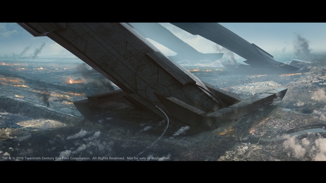
In vfxblog’s recent chat with Independence Day: Resurgence’s visual effects supervisor Volker Engel, he mentioned the importance of ‘selling’ the scope of the film to the studio before receiving the greenlight. Visual effects studio TRIXTER was crucial in this process, with its art department contributing key concept art for some of the film’s big scenes. Ultimately the studio also delivered on several visual effects sequences, too, as VFX supe Dominik Zimmerle outlines in this interview, complete with examples of the concepts and final shots.
vfxblog: Can you talk about TRIXTER’S approach to the concept artwork done in the early stages of production? What were the ideas the filmmakers wanted to communicate?
Dominik Zimmerle (VFX Supe): The purpose of the artworks, that our Art Department was creating in the early stages of production, was to visualize key moments of the movie when it was presented to the studio. TRIXTER’s job was to develop Roland Emmerich’s vision in key images, so that the studio could already get a close idea of how the film might look like.
Simone Kraus, Animation Supervisor and Co-owner of TRIXTER, and Art Director Luis Guggenberger and their team started a close collaboration with Roland. They reviewed references with him, created sketches, for the general framing and composition, based on his ideas, and then refined the 17 production paintings within only 6 weeks. Volker Engel was providing the art department with various references from the original film to help the team to follow the same visual language. Inspired by these, the artists created the most dramatic moments of the movie, like the reversed gravity, the Mothership’s landing, space battles, among others.
All of the images were done in Photoshop with some addition of CG elements. From a stylistic point of view, the concept artists tried to stick to a photo-realistic style, so that the audience could clearly imagine what the shot might look like in the movie. As you might see, there is still a very close relationship between these production paintings and the final shots in the movie.


vfxblog: What were some of the shots/scenes/artwork you delivered and how did you make them?
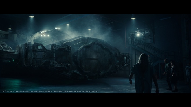
Dominik Zimmerle (VFX Supe): Essentially we had three big sequences that we worked on. One was taking place on the Moon, one in the Research Hangar of the R51 facility, that was already established in the first Independence Day movie, and another one in the so-called Isolation chamber of the same site.
Our biggest and foremost task on the Moon was to establish a gigantic wormhole out of which the spaceship of a new alien race is manifesting. In the same scene, this spaceship is shot down by a planetary defense system, that mankind was building on our satellite to prevent hostile actions from outer space and we were also taking care of these events.

The idea of the wormhole was initially established for a sequence that took place on one of the Moons of Saturn and out of which the mothership was coming. This was also the context in which our Art Department was developing the look of the wormhole though several iterations. The Saturn sequence didn’t make it into the movie, but the well liked artwork did and this was our starting point to this journey.
To match the structural complexity of the wormhole we needed to split the FX into many layers (in the end we had around 30) and blend everything in comp. Additional to the amount of layers we had also different approaches for each layer: we had volumes, particle layers, fluid simulations, etc.. All FX was done exclusive in Houdini.

Additional to that, we needed to work out the creation of the wormhole: we started from a sand swirl that went over into a sandstorm that eventually opened up to the wormhole. This swirl element was a huge asset by itself, consisting of around 750 Million particles.
In the research hangar we had to create a CG set extension in the background of the main area, alongside the related assets, so the hangar entrance area, a wreckage piece from the moon – a remnant from the spaceship that was shot down – and the sphere that is conserved within this wreckage piece. The spacecraft was provided by another vendor. The sphere was also the main asset of the isolation chamber sequence and is actually the star of both scenes. Concept was provided by the client in this case, although we created proposals for the sphere in activated mode – so when it is talking to the people and emitting the holograms.


It is from an ancient alien race, that came to earth to warn mankind and to save as many as possible. To illustrate the fate of earth and the battle of its civilization it employs holograms, that were visualized by our Art Department and then adapted for the movie by our VFX team. The idea behind the hologram was to give it an organic feeling, that is not necessarily projected but is rather based on tendrils of free floating energy. Additionally we were doing first post viz of the storybeats, that should take place inside of the projections in close collaboration with Roland Emmerich and then implemented the refined ideas into the final shots.
For the hangar set extension, we decided for a full 3D approach. Matte Painting was considered as well as baking a lot of the illumination information instead of lighting each scene, but we quickly realized, that although not immediately notable when you watch the sequences, the light actually changed a lot – even more since illumination from the holograms was already set up on set. So in order to integrate the CG as good as possible the best solution was to create a flexible yet consistent light template in Katana, that the lighting team could adapt to the needs of their specific shot. Our Lead Lighting and Look Development Artist Andreas Krieg did a marvellous job here to establish a tangible and atmospheric lighting situation.
A big challenge in this context were actually the textures of the wreckage piece. Since we sometimes move very close to the asset – parts of it sometimes cover the whole screen – we needed to go for very high resolution textures along with quite a lot UDIMs. Fortunately Mari didn’t have any trouble with that and after giving our artist some GPU muscles it worked really nicely.
vfxblog: Can you discuss the holographic effects work done by Trixter? What were some of the design considerations here?
Dominik Zimmerle (VFX Supe): One very important design aspect was to make it look alien. The sphere itself is a high-tech entity far more advanced than human technology, and so the technology that it employs needed to feel out of this world. Roland very early liked the idea of having something organic moving, evolving and condensing around the sphere. One point was, that the storybeats should feel like splitting off the main “bubble” around the sphere, somehow like we know it from cell division but with more spatial offset. We provided a lot of concept art to better find out what general directions he liked.
In the beginning it was not clear, how the activated sphere would look like, so the hologram emission was strongly related to the structure of the sphere. Eventually the sphere stayed in its initial hard surface look also when activated, but the tendrils were still allowed to freely float around. So rather than projecting a hologram, the sphere emits free energy that is forming the hologram. It is like a building process outside the sphere. Roland’s focus on the shape as a whole, rather than aiming at a plausible derivation of a projection method that would be motivated by today’s technology, helped a lot to create something new and gave an additional hint to the technological superiority of the sphere-alien-race.

vfxblog: How were those holographic fx achieved from a technical point of view?
Dominik Zimmerle (VFX Supe): The hologram look was heavily influenced by shot specifics like perspective, distance and context. In order to enhance flexibility in comp each element had been rendered separately with additional AOVs. To give even more control to the compositors everything was rendered as deep image files. The holo system produced those elements based on three main setups, only one of them using a simulation based approach.
Our Lead CG Artist Stefan Galleithner took over the FX task and came up with some very robust and efficient setups in Houdini. Stefan and our Lead Compositing Artist Andreas Gebauer then worked closely together to define the look of the hologram.
The first element was a fluid like particle simulation that represented an unfocused generic energy flow of the holograms, especially in the areas close to the floor. It was created with particles advected by a filament system and additional guide curves to get membrane like smooth structures.
Another layer resembled a three dimensional layered web based on a metaball “bubble” defining the hologram volume. The web’s strands were a result of intersecting several copies of the bubble (think of a matryoshka doll) with a volume displaced by turbulent noise. These curves then were advected by velocity fields and projected on different layers of the bubble hull.
However, the most defining element probably was what I like to call “the squids”: concentrated peaks of energy followed by a almost smoke like, elegantly moving trail. These elements were not based on a simulation but relied on procedurally created geometry and deformers controlled by various parameters. The starting point was again a curve. This curve then was duplicated many times to create the visible tendril shape. The deformers moved the individual curves and the shape as a whole by procedural and manual animation. Mainly the organic motion was a result of a combination of different noise patterns and attributes used by the shader.

vfxblog: Any other work you’d like to mention?
Dominik Zimmerle (VFX Supe): Something that you won’t see in the movie, but probably parts of it as “deleted scenes” on the Blu-Ray/DVD release, and that we actually put quite a lot of effort in, was the previz work we did for the Saturn sequence that I mentioned before. This was a very interesting experience for us, since we could work directly with Roland Emmerich on compositions, cameras and get direct input on the story from his side. We even provided storyboards for the sequence. Being part of this creative process and finding efficient ways to translate the directors vision quickly into moving previz shots was at the same time demanding but extremely rewarding.

According to director Sam Southward: the above. A new article for Cartoon Brew and the online premiere of the short.