
Apr
03
Lucinda Schreiber for Telstra
Posted in: 2d, General, paper, Stop-motion
Great stop motion paper animation from Lucinda Schreiber for Telstra.
Directed and Animated by Lucinda Schreiber
Great stop motion paper animation from Lucinda Schreiber for Telstra.
Directed and Animated by Lucinda Schreiber

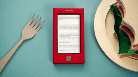
After much speculations and rumours, Google launches its own eBookstore today. Lots of talk about its pros and cons, as well as discussions about whether this would turn people away from other paperless book formats, such as Kindle, and so on.
But luckily for us all, this is a Motion Design blog, so let’s get to the juicy bits–here’s the spot announcing the launch. Once again Google favours the hand-crafted aesthetic, which I personally think is a smart move. Not only it is in keeping with the rest of Google’s campaign (eg. Chrome), but it also somewhat appeals to consumers like me who prefer the paper to pixel. In addition to saving trees, (although I don’t claim to know the exact carbon-cost advantage of eBooks), this campaign may just be the final push I need to switch to this new way of reading.
Thanks for the tip, Mungo and for the research, Igor!

Paper can be so misunderstood. It seems like no one, besides Michael at Dunder-Mifflin, appreciates paper and its limitless possibilities. Giving paper its well deserved limelight, the Museum of Arts and Design is currently featuring the Slash: Paper Under the Knife exhibit, which shows from now until April of 2010. Check out the many multidimensional layers cellulosic pulp can offer, with over 50 artists contributing to the exhibit.


Jamie Caliri can always be counted on to imbue a project with hand-made charm and incredible attention to detail. Ever since seeing the 2006 “Dragon” for United Airlines, I’ve been enchanted by his unique approach to storytelling.
His latest project comes through LA-based DUCK for Showtime’s new series about a single mother with multiple personality disorder, The United States of Tara. Using cut-out illustrations from Alex Juhasz, the sequence presents a series of layered vignettes populated by the show’s star. Says Caliri:
They wanted a pop-up book look. We decided to try to make as many real pop-up pages as possible and only cheat when we needed. I think it ended up being a fun mix of pop-up and animation.
Alex Juhausz really nailed a great Americana/comic book feel with his illustrations and Anthony Scott brought his usual sensitivity to the animation. The team really pulled together on this one and I think it shows. We had fun.
The United States of Tara is co-executive produced by Diablo Cody (Oscar-winning screenwriter of Juno) and Steven Spielberg.
Check out the Dragon Stop Motion Software blog for some behind the scenes action on the project. Also see Jamie’s follow-up spot for United Airlines, “Heart.”
Posted on Motionographer

So, due to popular demand, I’m pleased to re-present (as a full post) the title sequence to ‘Capitu’–a TV miniseries, based on a 19th century Brazilian literary masterpiece, Dom Casmurro, written by Machado de Assis. Told retrospectively from the point of view of the aging central character, it describes his obession with finding all kinds of evidence that his wife had been unfaithful, and his own best friend is actually the father of their only son.
What struck me is the amount of research, meaning, and integrity that goes behind this. Since the book is considered a ‘forerunner of Modernism (at least in Brazil)‘, the team’s initial inspiration is Dadaism, specifically the decollage technique (creating an image by cutting, tearing or otherwise removing pieces of a picture to reveal parts of other images lying beneath).
According to Lobo, ‘the chaotic and disjointed nature’ of Dada decollage pieces parallels the nonlinear, short-chaptered structure of the novel. Layering of images suggests the passage of time, memory, and accumulated life experience, and the tearing/ripping evokes the violence inherent in the central character’s tormenting doubts and desire for vengeance.
The animation was first created in After Effects, then each frame was printed on different paper stock. The printed frames were crumpled, restretched out and glued one on top of the other, and the entire stack was then placed under a stop-motion camera. Shots were taken at appropriate intervals as the layers were ripped and peeled. The photographs were taken back into after effects to create the final stop-motion sequence.
Lobo has been kind enough to provide us with the ‘making of’ video and a very eloquent write-up about the conceptual and aesthetic rationale behind it. Click on the link below to read it all…highly recommended.
In 2008, Lobo was commissioned to create the opening sequence and interstitials for Capitu, a TV mini-series adaptation of Dom Casmurro, the masterpiece by 19th-century Brazilian novelist Machado de Assis. The story is narrated by the title character, an aging man who decides to write his memoirs in an attempt to “tie the two ends of life together”. But the true purpose of his endeavor is to search for proof justifying his undying obsession: that his childhood sweetheart, Capitu, whom he finally succeeded in marrying, had betrayed him with his best friend, the real father of their only son. What makes Machado’s novel unconventional is that he treats the traditional themes of marriage and adultery as a mere backdrop for an exploration of surprisingly modern literary concerns: the unreliability of the first-person narrator; a skeptical awareness of the novel’s structure; the failure of memory in recapturing past facts objectively, functioning instead as a means for self-justification and self-deceit.
Lobo sought to encapsulate these issues in the opening sequence, not just through the choice of imagery but also in a way that involved the animation technique itself. The preliminary research started with the early 20th-century art movement Dada, following a suggestion by the series’ director Luiz Fernando Carvalho. Since Dom Casmurro is considered a forerunner of Modernism, at least in Brazil, we thought it made sense to start with some of the most radical pioneers of the avant-garde. We focused mainly on Dada artists who used collage and photomontage as their media of choice. The chaotic and disjointed nature of their work paralleled the fragmented structure of Machado’s novel, with its short chapters, nonlinearity and constant interruptions as well as remarks by the narrator himself. This research on the evolution of collage eventually led us to discover the works of post-Dada European artists like Wolf Vostell, Mimmo Rotella and Jacques Villeglé. They developed what became known as decollage: instead of building up an image by adding parts of other images, they worked by cutting, tearing or otherwise removing pieces of a picture to reveal parts of other images lying beneath.
This approach seemed perfect for the task at hand. The superposition of images provided a fitting metaphor for the passage of time and the accumulation of experiences throughout one’s life. Ripping through these levels mirrored the process of peeling the layers of memory carried out by the narrator, in search for the final truth buried in his past. The act of ripping also suggests violence, representative of his tormenting doubt and desire for vengeance.
Visually, the distressed result of this procedure was also appropriate, since it connected in many ways with the art direction of the mini-series. The show was predominantly shot inside a run-down mansion, using recycled materials for settings and props. The theater and the opera are recurring elements in the novel, so the production relied on classic theatrical techniques for the recreation of the environments. This inspired us to base our layouts on old letterpress show posters – the same material largely employed by the decollage artists.
We wanted the aesthetic and the animation technique to be fully integrated in these pieces, which meant that the ripped paper should be more than just a graphic style: it should be the very mechanism that drove the animation forward. We started by preparing simple animations in After Effects, primarily featuring typography and collage-like graphics representing key concepts of the story. These animations were edited together with short live-action clips from the series, and the entire sequence was then printed sequentially, frame by frame, on different kinds of paper. These sheets were glued on top of each other, resulting in a stack of paper that had the first frame of the opening at the top and the last frame at the bottom. We mounted the stack below a table-top digital camera and proceeded to rip and tear the paper sheets one by one, slowly revealing each layer underneath. This process was photographed at regular intervals, and the pictures were imported back into After Effects as a sequence, where it received some slight color and time adjustments.
The result was the same animation and live-action sequence we started with, only fractured and reassembled in such a way that never allows for a single intact frame. Every image that begins to take shape never achieves its complete form; every ripped bit of paper reveals something that belongs to another point in time. The spot resolves itself only at the end, unveiling the word Capitu: the only person who holds the key to the mystery of the story.
Posted on Motionographer
This is site is run by Sascha Endlicher, M.A. during ungodly late night hours. Wanna know more about him? Connect via Social Media by jumping to about.me/sascha.endlicher.


